Sahana Banavara
Product Designer · Bengaluru


 More Work


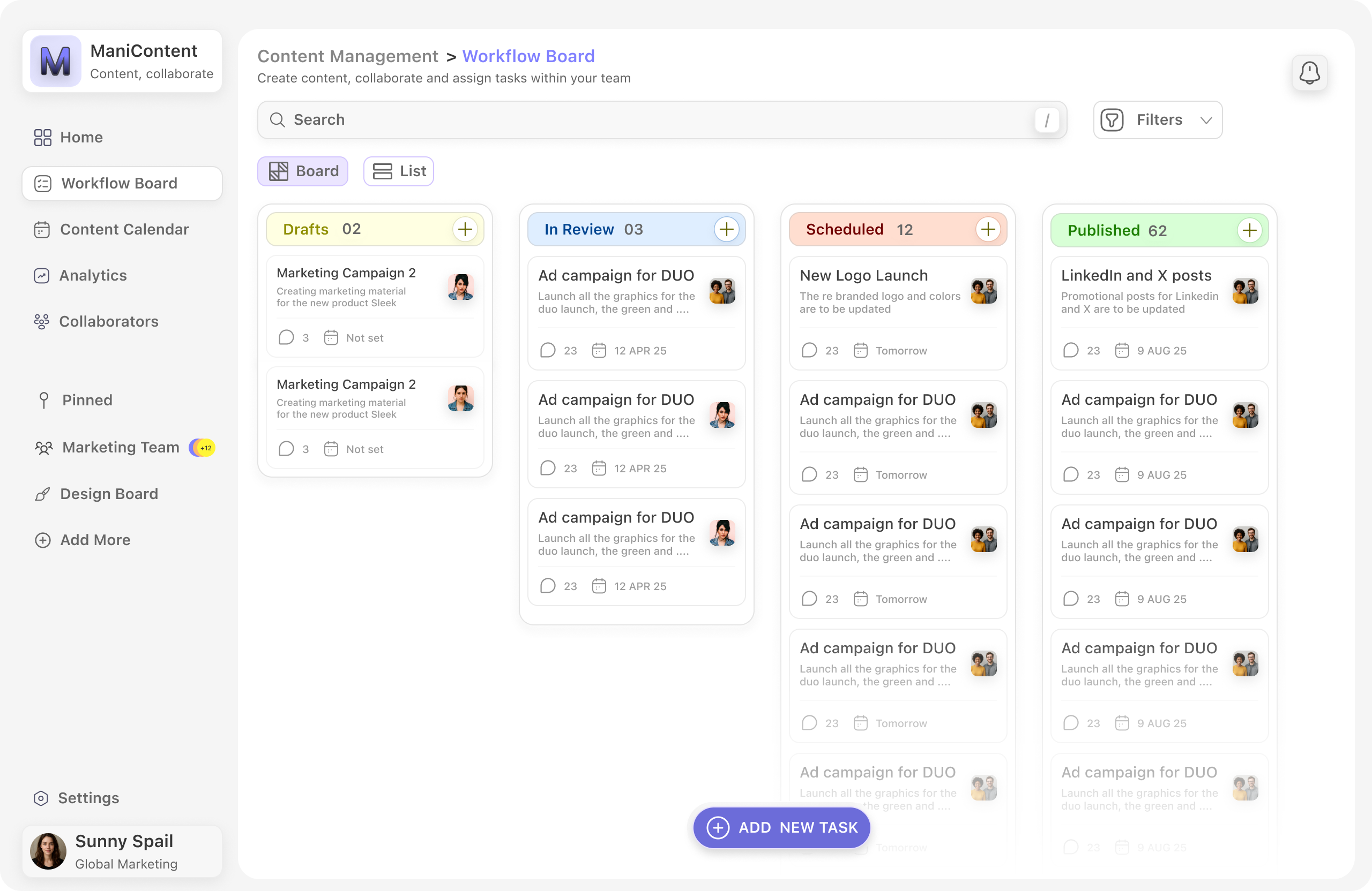
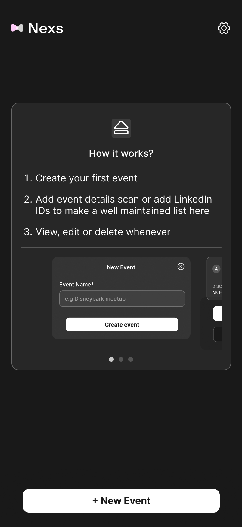
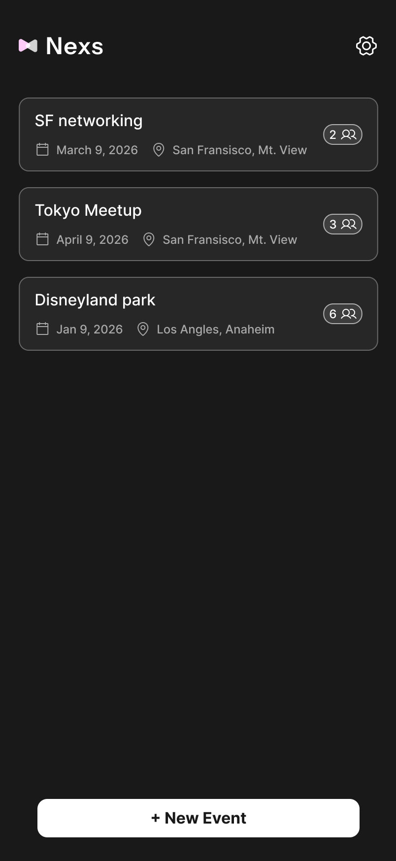
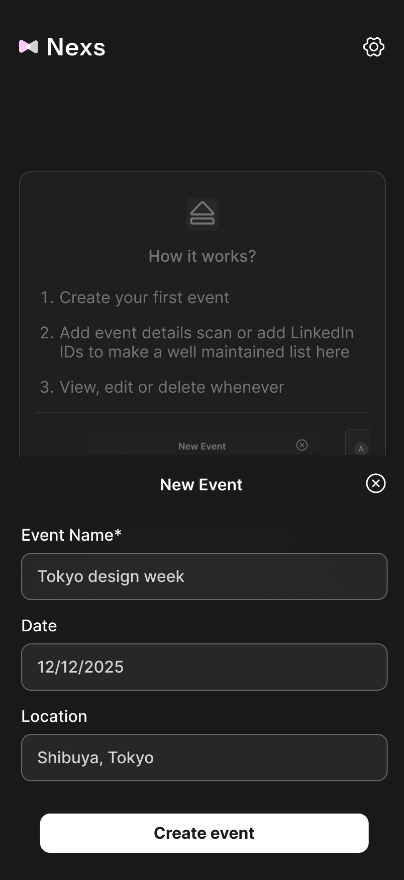
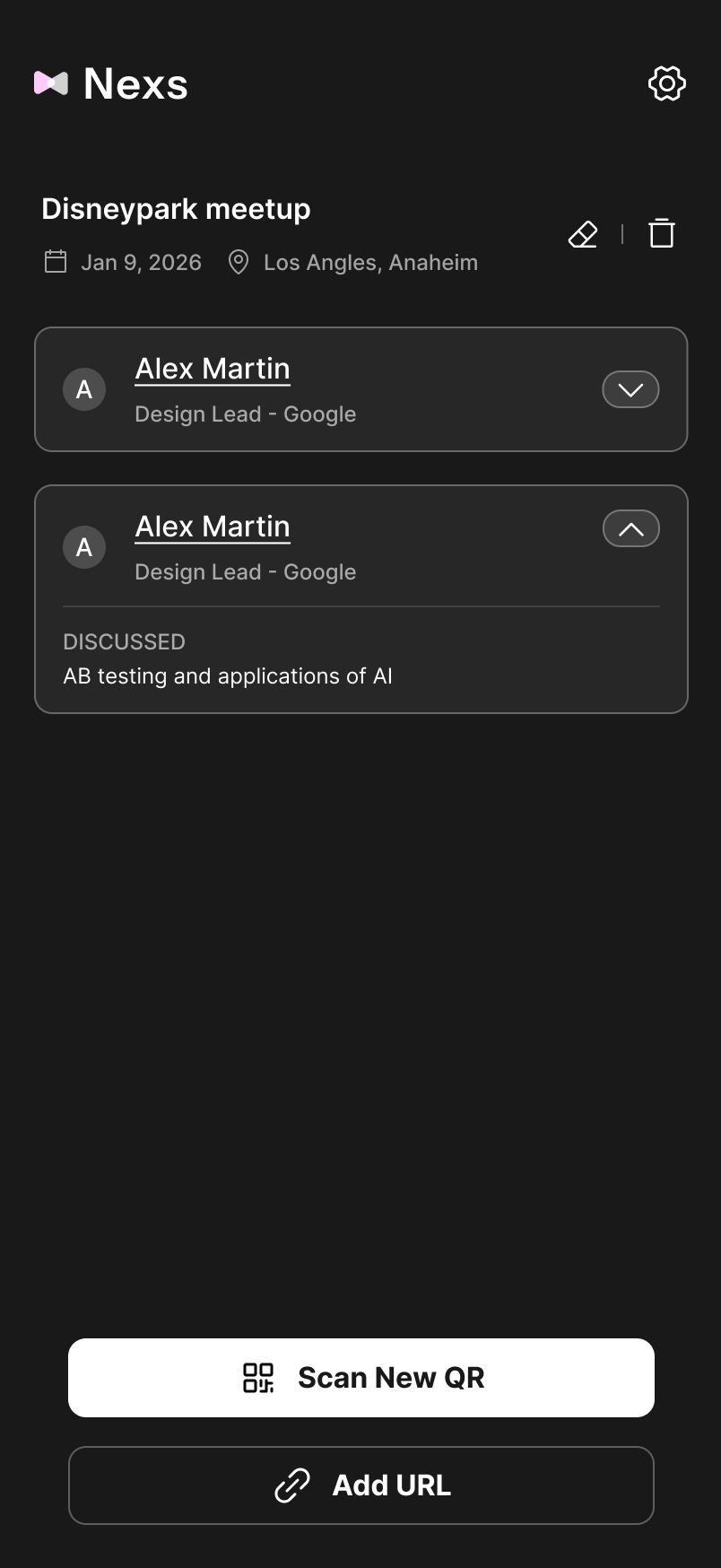
Nexs — remember
who you met.
You go to events. You meet people. You connect. A week later — no idea who they are or why you connected. Nexs fixes the part every networking tool ignores: the context.
LinkedIn remembers who they are.
Not who they are to you.
I was scrolling LinkedIn and came across someone I'd had a genuinely good conversation with at a design event. Their name, their face — nothing. I'd connected, which meant I'd signalled interest, but I had no memory of who they were to me.
This isn't a memory problem. It's a tool problem. LinkedIn is optimised for broadcasting, not remembering. It captures who someone is — not where you met, what you talked about, or why you wanted to stay in touch.
"No other networking tool asks: what did you talk about?"
Four screens. One question that matters.
Where the real design happened.
The flow, from start to finish.
Every decision you just read about — visible in the prototype.
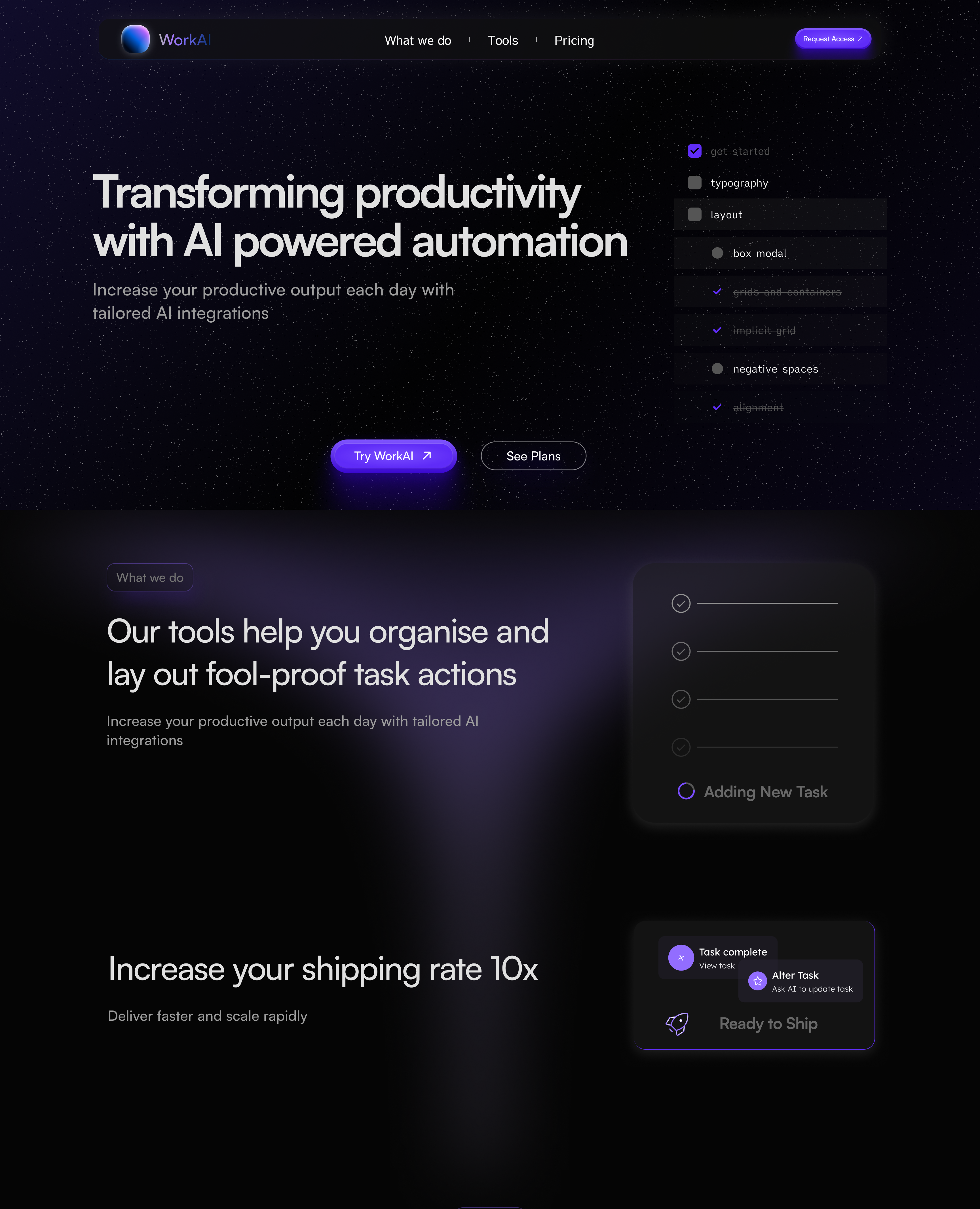
Odin — AI that knows
your machine.
Your computer knows everything about how you work. It just never tells you anything. Odin changes that.
The vision, in 60 seconds.
Your desktop is a crime scene.
Nobody investigates it.
Hundreds of files, duplicates, folders untouched for years — your computer knows all of this. It just never tells you. Every unorganised file is a small tax on your attention. Odin watches how you work and surfaces what matters, before you have to ask.
"The computer already knows what you need. Odin just tells you."
Designed for people who don't want
to think about their files.

Proactive suggestions — Odin speaks first

Natural language — ask anything about your files

One tap actions — archive, sort, delete
Three decisions that shaped it.
Ready to build.
Odin is a designed prototype with a working demo. The foundation is solid — calendar integration, a proper natural language layer, and a menubar agent that genuinely learns. The product is ready to be built.
3 years of work
shipped.
Research-led design across e-commerce, proptech, and B2B SaaS — from discovery to production.
Case studies in progress.
Add your professional case studies here — each one showing the research, decisions, and outcomes from your shipped work.
Blox — redesigning the path
to sign up.
Property buyers were dropping off before they ever committed. The form was broken, the CTAs were unclear, and the flow had no logic. A research-led redesign changed that — sign ups improved by 30%.
Good product,
broken front door.
Blox connects property buyers with verified listings. The product was strong — but the sign up experience was leaking users before they ever got in. Poor form design, unclear CTAs, and a flow with no logic. Buyers arrived with intent and left without committing. The data confirmed it. The fix required going back to the user's mental model — what does someone trying to buy property actually need to feel confident enough to create an account?
The redesign, at a glance.
Four frames from the full case study — the moments that tell the story.


The complete journey.
Every screen, annotation, and decision — click through the full prototype below.
30% more sign ups.
Measurable, shipped, real.
What I learned — Poor CTAs aren't a copy problem, they're a trust problem. Users don't click when they don't feel safe. The redesign worked because it restructured the emotional journey, not just the visual layout.
Blox Gallery — making
property feel real.
Images were broken, unstructured, and sending users away. A research-led gallery redesign across three surfaces brought them back — and kept them there 19% longer.
The gallery was losing people
before the property did.
On a property platform, images are the product. The Blox gallery had no structure guiding users from homepage through to the property display page. Images were distorted, aspect ratios inconsistent, and the live viewing feature existed but wasn't discoverable. Users were arriving and bouncing before they'd seen what they came for.
Three surfaces.
One coherent experience.


The complete redesign.
Every surface, decision, and before/after — the full deck below.
More clicks. More time.
More trust.
What I learned — Image quality is a design system problem, not a content problem. By setting upload guidelines and enforcing aspect ratios, I fixed the root cause upstream rather than patching symptoms in the UI.
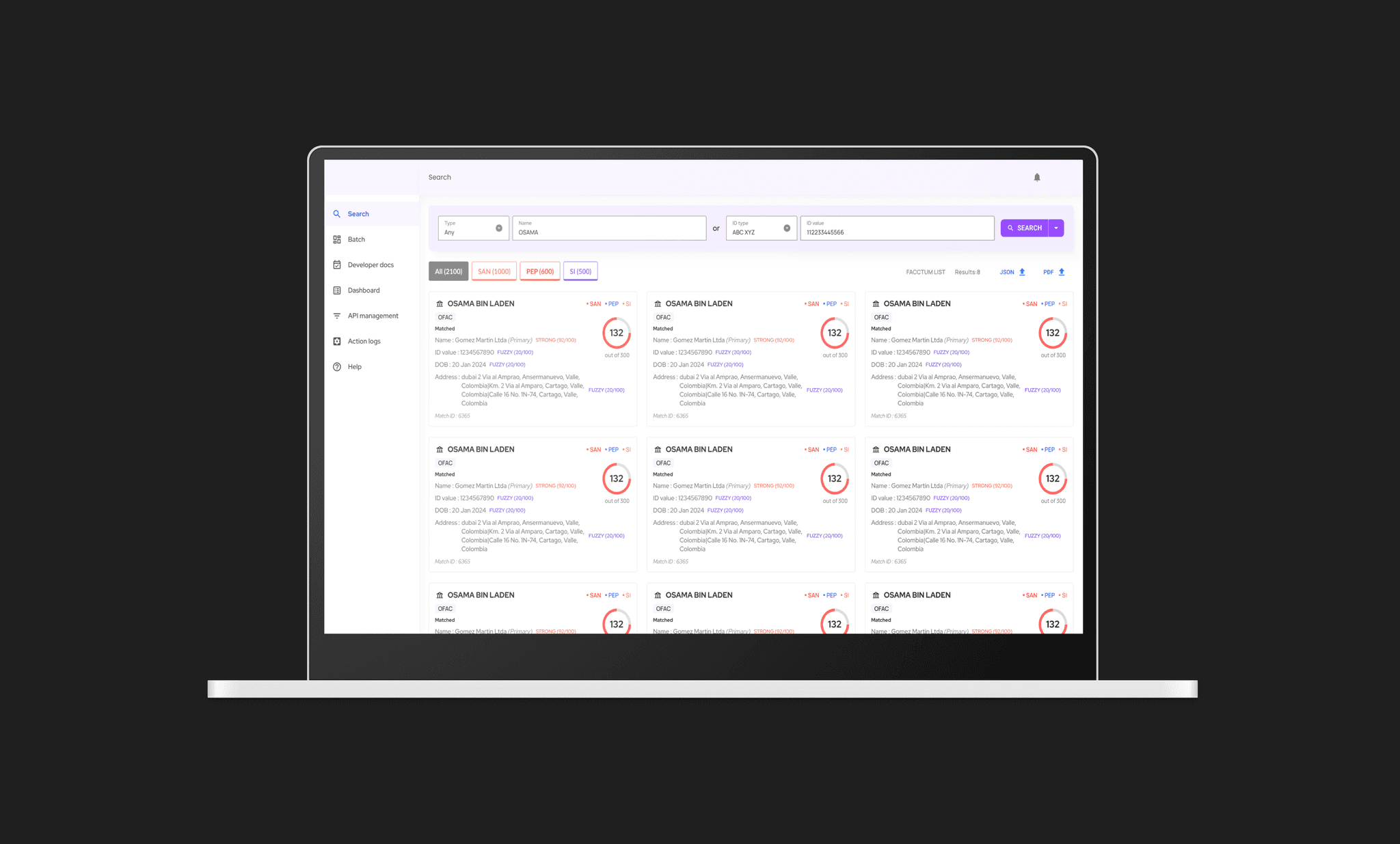
Financial Crime SaaS —
designing for compliance at scale.
Large financial organisations need to monitor millions of transactions for signs of criminal activity. The tool existed. The experience didn't.
Flagging, monitoring, and making sense
of financial crime data.
This is a compliance monitoring tool used by large organisations to analyse order data for financial crime signals — flagging suspicious activity, tracking cases, and helping compliance teams act faster. The users are financial crime analysts who spend their entire day inside this tool. Every second of friction is a second of compliance risk. I designed core workflows including the ticketing system and the search and categorisation interface — making it faster for analysts to find, flag, and act on suspicious patterns in large datasets.
Complex data. Non-technical users.
Zero margin for error.
Financial crime compliance tools have historically been built by engineers for engineers. The interfaces are dense, the workflows are non-obvious, and the cognitive load is enormous. My job was to make the complexity invisible — to design a system where analysts could move through large volumes of data without losing track of where they were or what they needed to do next. The design had to balance information density with clarity. Every screen needed to answer one question clearly before asking the user to make a decision.
The interface.
Select screens shown — full case study available on request.
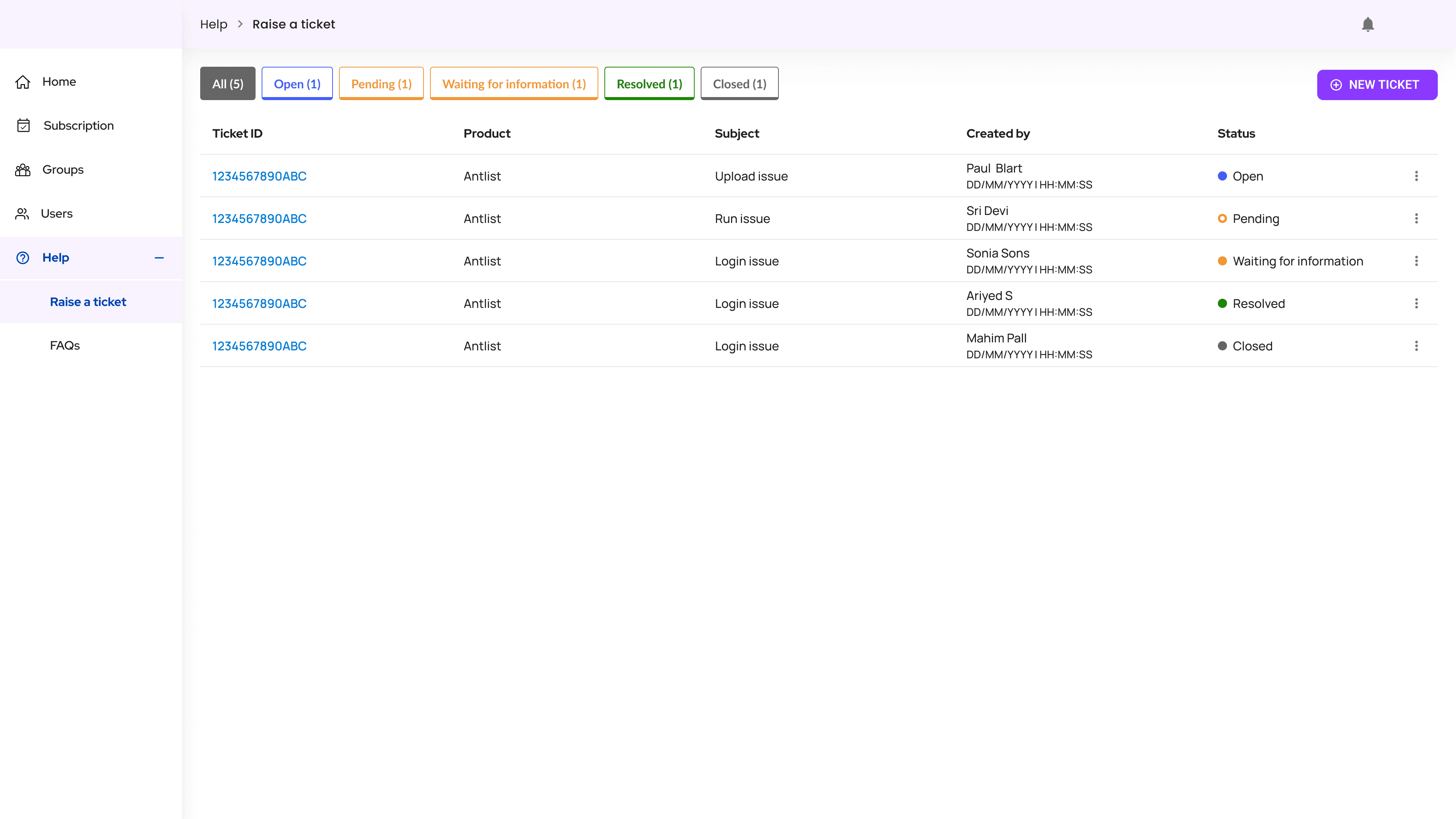
Ticket raising flow — structured input for complex compliance events
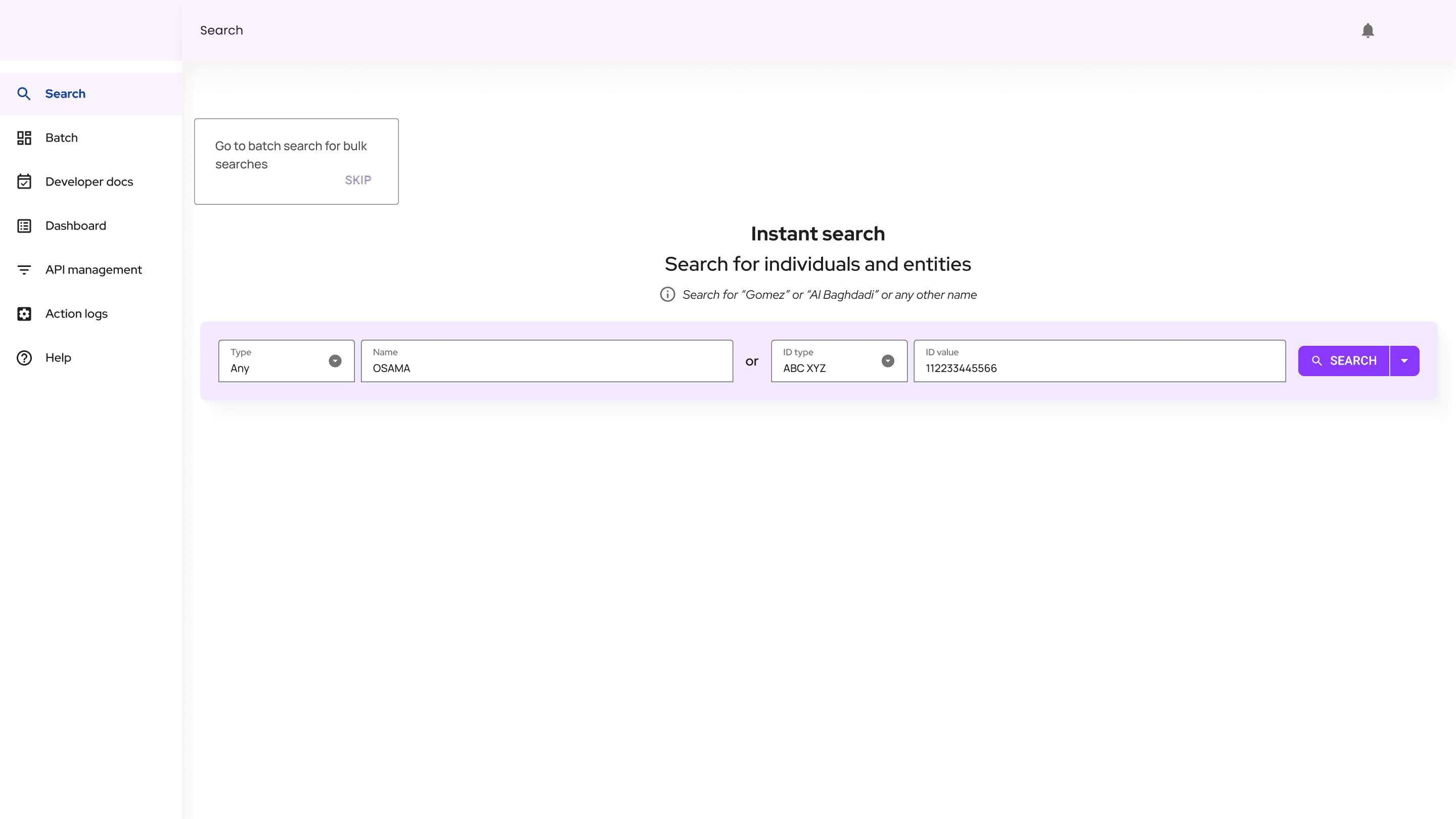
Search and categorisation — name-based filtering across large datasets
Seamless workflows for
high-stakes work.
What I learned — In enterprise tools, the biggest UX win is reducing the number of decisions a user has to make per task. Compliance analysts don't have time to think about the interface. The interface has to think for them.
More work &
experiments.
A collection of shipped work, side explorations, and in-progress ideas that don't fit a single case study.